
A comment to the first X-Men story made me realize that, in addition to having a really bad first costume, the X-Men had a weird evolution during their original incarnation.
As such let’s have a look at how their costumes varied from 1963 through 1975, before the team was completely changed.
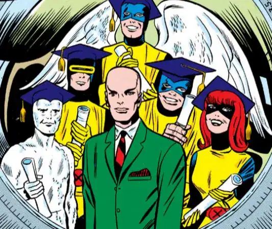
PROFESSOR X
X-Men #1: the wheelchair
Xavier doesn’t really have a costume in the original run… in fact he SHOULDN’T have a costume, but that’s a separate discussion.
Nearly perfect for the character, but I’m not fond of the sheet over his legs and most of the chairs tend to look very ugly. Yes it’s all realistic, but not visually interesting.
Score: 8 / X

X-Men #9: the super-wheelchair
Who do you think you are, Chief from the Doom Patrol?
Score: 5 / X
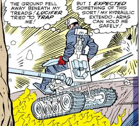
Aside from that dip, Professor X keeps the same look throughout the original run.

CYCLOPS
X-Men #1: original uniform
I feel like Cyclops is the only one who actually looks good in the original uniform, on the strength of how it perfectly integrates the visor.
Originally he had to touch the visor with his hands to use his powers, and it was later changed to having a hidden button inside the gloves… but since that’s not a visible change, it’s not ranked separately.
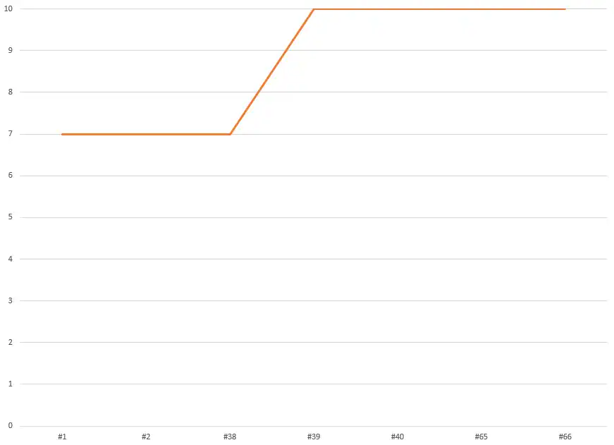
Score: 7 / X
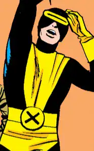
X-Men #27: new uniform
Essentially the same of the original, with just the addition of the red X and a slightly more distinct visor thanks to the coloring. If the story didn’t point out this is a new costume I might not even have noticed, so it gets the same score.
Score: 7 / X
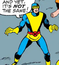
X-Men #39: first individual costume
The platonic ideal of a Cyclops costume.
Score: 10 / X
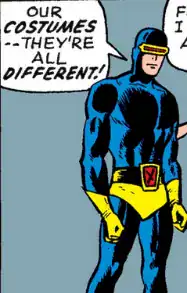
So basically Cyclops is just fine for little more than the first half of the run and perfect afterwards.
ANGEL
X-Men #1: original uniform
Not as eye-catching as Cyclops because of the lack of any interesting detail. But the contrast between the black costume and the white wings does make them stand out a little more, which is more than I can say for the later versions.
Score: 6 / X

X-Men #27: new uniform
The more visible X is a slight improvement, not really enough to affect the score.
Score: 6 / X

X-Men #39: red & yellow suspenders
This is the ugliest Angel costume ever and among the worst superhero costumes in history. When a blind guy makes this color combination work better, you know you screwed up.
Score: 0 / X
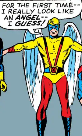
X-Men #55: the Avenging Angel
By contrast, this is retconned into being the FIRST Angel costume from his VERY brief solo career before joining the X-Men.
It might be the best costume he’s ever worn.
Score: 8 / X

It’s not just in the flashbacks: he goes back to this version in X-Men #60.
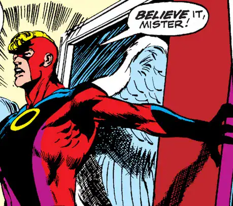
X-Men #62: the white Angel
The Avenging Angel COULD have been the best costume he’s ever worn… if it wasn’t for this one.
No notes, this is perfect.
Score: 10 / X
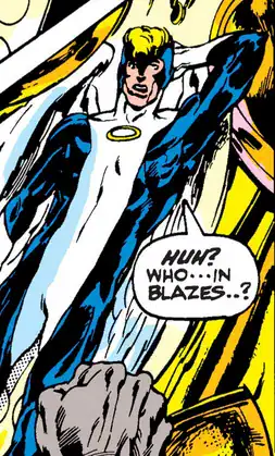

Angel would keep that costume until the end of the original run (which isn’t a lot, considering it ends with X-Men #66).
He switches to a very ugly costume in Champions #1, but since that’s from the same year the new X-Men team debuts it’s out of the scope of this ranking.

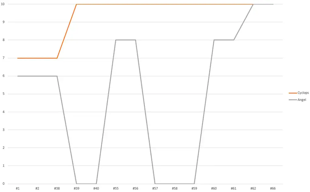
Quite a different trajectory from Cyclops!!! You might think I’m being too harsh on the red suspenders costume, but I hate it THAT much.
BEAST
X-Men #1: original uniform
Like Angel, the only notable part is from his mutation. But unlike the wings, hands and feet are notoriously hard to draw even for the best pencilers, leading some ugly panels.
Score: 5 / X
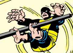
X-Men #4: yellow gloves
Beast gets his gloves as early as X-Men #2’s cover, but in-universe he doesn’t start wearing them until two issues later.
They make a bit more sense than leaving fingerprints everywhere, but he doesn’t escape the genericness of the uniform.
Score: 6 / X
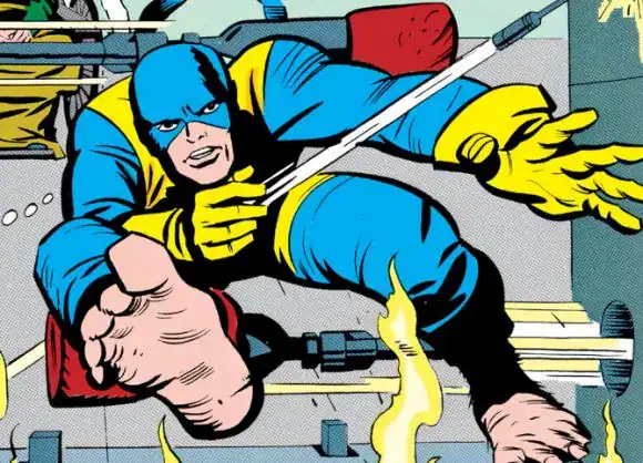
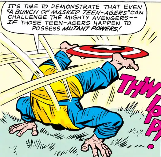
X-Men #9: gloveless again
Of all the times to ditch the gloves, it’s the issue where they fight the Avengers!
Score: 5 / X
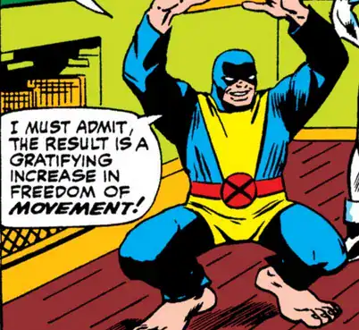
X-Men #27: gloveless new uniform
It looks basically like the old one plus the more visible X. Still doesn’t do it for me.
Score: 5 / X
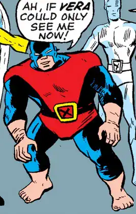
X-Men #39: first individual costume
At least the colors are not fighting with each other like with Angel’s atrocious costume. Not a huge change from the previous one, but the X stands out ever-so-slightly better.
He would keep that uniform for the rest of the series.
Score: 6 / X
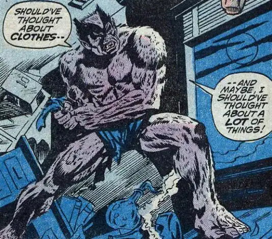
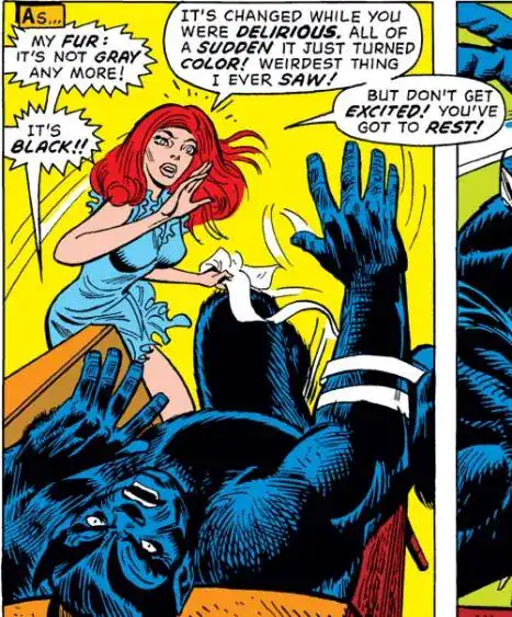
Amazing Adventures vol2 #11 (1971): the Grey Beast
Unlike Angel, I have to count Beast’s RADICAL change after the end of the original run!!!
Now he looks ALMOST like the modern Beast, but he was initially grey.
Score: 8 / X
Amazing Adventures vol2 #15 (1972): the Blue Beast
The following year, he reaches his perfect form.
Score: 10 / X
Turns out that Beast has the most mediocre costume until the series ends.
ICEMAN
X-Men #1: the Snowman
I just can’t take him seriously like that. I suppose having him without a face is slightly original?
I am not ranking his de-iced costume: not only because it’s just a pair of trunks, but because he doesn’t go into battle without the ice.
Score: 2 / X
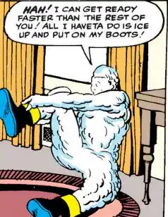
X-Men #5: the Snowman with no boots
Considering his preferred method of travel is sliding on sheets of ice, this makes slightly more sense.
Score: 3 / X

X-Men #8: finally some ice
The only complaint is that there is no visual motif linking him to the rest of the team. Other than that, it’s perfect.
Score: 9 / X
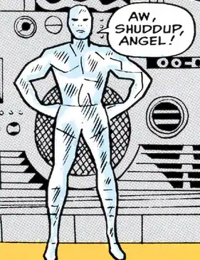
X-Men #11: yellow boots
It’s not as bad as his Snowman days, but Iceman with boots always looks wrong to me for some reason.
Score: 7 / X

X-Men #22: iced boots
It might have been a coloring mistake at first, but the boots start to be colored exactly like the rest of his ice form. Now we’re getting somewhere.
Score: 8 / X
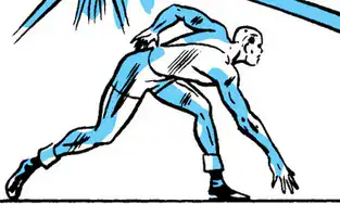
X-Men #39: icy belt
As part of the first individualized costumes, Iceman keeps the same exact thing he had been wearing… but now the belt is visible, finally identifying him at a glance as an X-Man.
Score: 10 / X
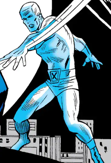
Iceman has a CRAZY recovery after debuting with the worst look!!!

MARVEL GIRL
X-Men #1: original uniform
As generic as they come. Not a BAD design overall, but lacking any flair.
Score: 6 / X
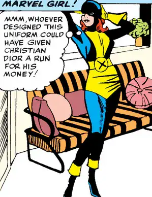
X-Men #5: pointy mask
Definitely an improvement, making stand out a lot more; I’m guessing she was tired of having too many bad hair days.
Score: 7 / X
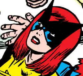
X-Men #7: headless mask
And she goes back to a more generic mask the following issue? WHY???
Score: 6 / X
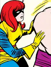
Since I’m giving it the same score of the version that covers the head, I’m not keeping track of when she’s wearing what: she alternates between the two for a while.

In retrospect, any costume that leaves long hair exposed is a bad idea.
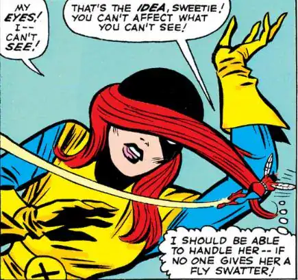
X-Men #27: pointy mask & new uniform
It took Jean THAT long to put on the pointy mask she debuted in issue 5!!! She also makes slightly adjustments to the yellow parts of the uniform.
Score: 7 / X
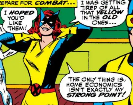
X-Men #39: the miniskirt
I understand Jean’s first individualized costume is polarizing among X-Men fans… some hate it and some love it.
The miniskirt doesn’t make a ton of sense from a practical standpoint for most super-heroines, but A) she’s not a physical fighter B) she rarely flies C) telekinesis possibly limits unwanted exposure D) she looks great.
Score: 9 / X
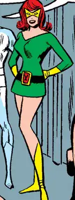
X-Men #46: short sleeves, no gloves
This is a mess of an issue when it comes to coloring: she has long sleeves in some panels, short sleeves without gloves for most of the issue, and randomly long yellow gloves in others.
I’m counting only the short sleeves as a variant and the rest as coloring errors.
Score: 8 / X
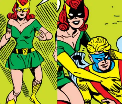
X-Men #48: short sleeves with gloves
Her regular short gloves still make the short sleeves work. She alternates between this and long-sleeved version for a bit.
Score: 9 / X

Her look gets almost consistently better throughout the series.
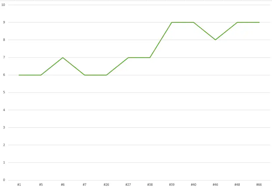
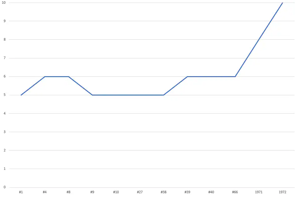
And here’s the full table (you can click to enlarge) of this perfectly scientific study.
Professor X is the most consistent, Iceman is the quickest to reach what I consider his ideal look, Beast is the slowest, Marvel Girl is the one with the steadiest improvement, and Angel has the highest variation.


That X-Men #7 panel makes Jean look like she is read to sub for Jan in Space Ghost stories.
Cyclops’ “individual” costume is a marked improvement, but it won’t look complete to me until he gets his revamped visor in the mid-70s. The old visor looked plain and uncomfortable by comparison.
The Beast always got the short shrift on all of his costumes. Even the “individual” costume was just a recoloring of his original. Aesthetically, turning furry was the best thing that ever happened to Hank McCoy.
A dissenting view on Marvel Girl’s mini-skirt: Gloves or no gloves, it looks to me like a dress she’d wear on a date or at a debutante party, not something one would wear in battle. Her original costume with the pointy mask was far better.
“In retrospect, any costume that leaves long hair exposed is a bad idea.”
MEDUSA: I beg to differ.
This is a rather interesting random thoughts to say the least. As for my thoughts on this…
Professor X: Yeah. Super wheelchair moment aside, He’s pretty much the default ‘evergreen’ ideal look for the character when you don’t wanna use the 90ies hoverchair or have him walking (which is really the only time he SHOULD have a costume and even then… ugh, please don’t bother)
Cyclops: what’s funny is that to get what’s pretty much the best costume for him was just to remove the yellow part of the original uniform. I know there’s differences and it wouldn’t be until 1975 where we would get THE Perfect Costume for Scott, mainly because the upgraded visor looks much better, but, it’s kinda funny that he’s the second fastest one to get to one of his Iconic looks.
Angel: Yeahhhhh, Warren had it a bit rough but at least he got His best (non-Archangel) look IN the book before it got cancelled. he looked meh in the OG uniform, he was a mess in his first personalized look (it’s not as bad as some of Kitty Pryde’s costumes but…) and it really wasn’t until Avenging and White Angel where he got some GOOD looks.
Beast: … yeah, there’s a reason Most adaptations either speedrun past or just out right skip Human Beast, poor guy did NOT have a decent costume during the original X-Men run.
Iceman: Quickest to hit his iconic look. After that, it was really just tweaks to make him be identifiable as a X-Man.
Marvel Girl: in terms of the OG uniforms, I feel like Jean sort of had it the worse, barring when she used the pointy mask, as Cyclops, Angel and Beast at least had some sort of Visual flair to help the outfit stand out a bit better. All Jean had was her hair out and during the times she had the headless mask out, She, as Luis pointed out, looked like she was going to help Space Ghost out.
as for the mini… I feel like the reason it had any sort of staying power is because Jean wore it in two of the Biggest X-Men Storylines(being Dark Phoenix Saga and the Krakoa arc) because while it’s not a bad look per say… Jean’s best outfits are pretty much out of the range of this post.
to sum it up, Professor X pretty much started out the best, Iceman got the quickest to his best look, Cyclops pretty much needed to ditch the yellow on the chest to hit his best fit, Angel REALLY needed someone to talk him into getting into his Avenging Angel outfit sooner, Marvel Girl ranged from Bland to fine and Beast really,really, really needed to get pulled away from the X-Men to his best/iconic look.