
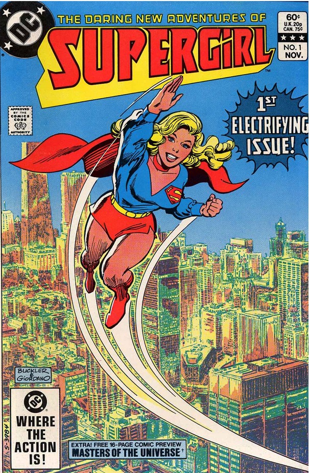
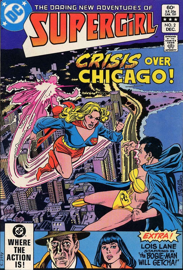
Supergirl v2 #1 (1982)
by Paul Kupperberg & Carmine Infantino
cover by Rich Buckler
We have reached the last era of Supergirl: a regular series that will last 23 issues, over twice as long as her first regular.
While the cover by Rich Buckler is quite nice, the regular artist will be Carmine Infantino…
…which would be fine for the 60s, but this is 80s Infantino with inks by Bob Oksner, and the artwork for the entire series is going to look like THIS.
Yeah… that’s one of the reasons why I have an extremely hard time enjoying this series.
Infantino was a great artist with an enormous legacy… but on THIS series, I’m sorry but the artwork is just plain ugly to me.
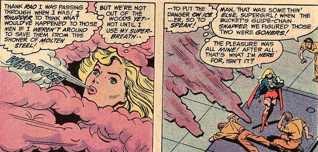
It doesn’t help that most of the time I’m thinking “WTF is she wearing!?!?!?”, and it’s worrying that I never thought that in the 70s.
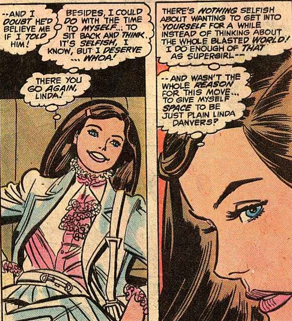
As noted in the comments of previous reviews, it’s very weird to see Supergirl think of herself as “Linda” and not “Kara”.
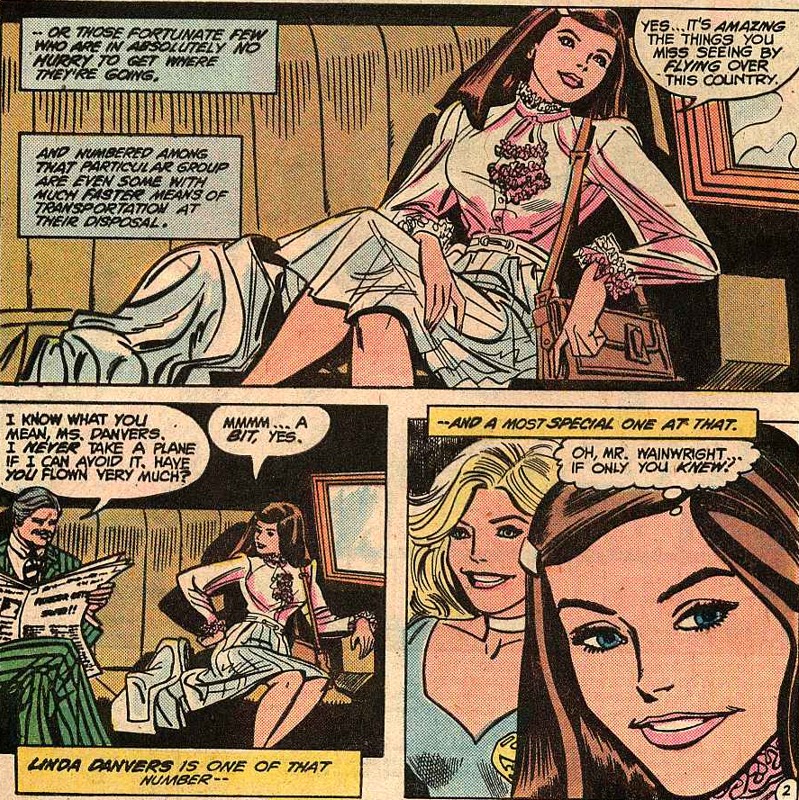
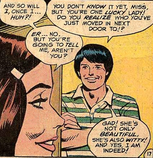
Anyway, the latest change in the status quo has Supergirl move from New York to Chicago.
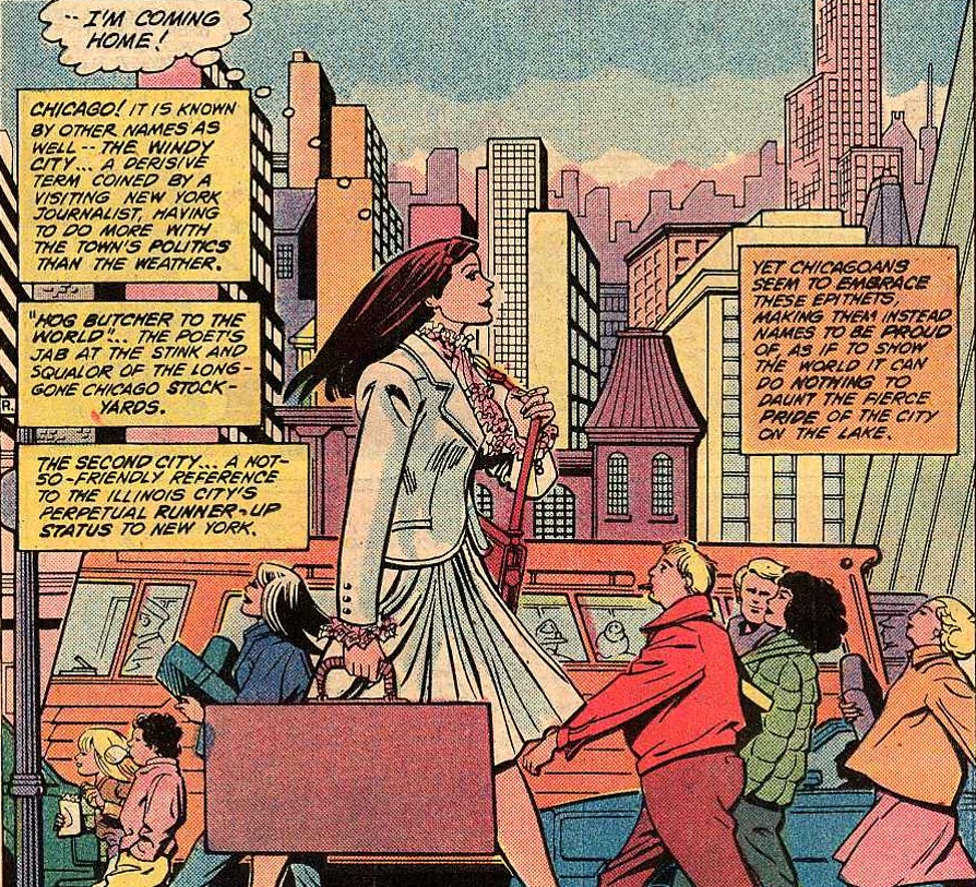
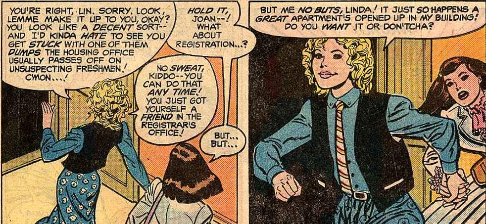
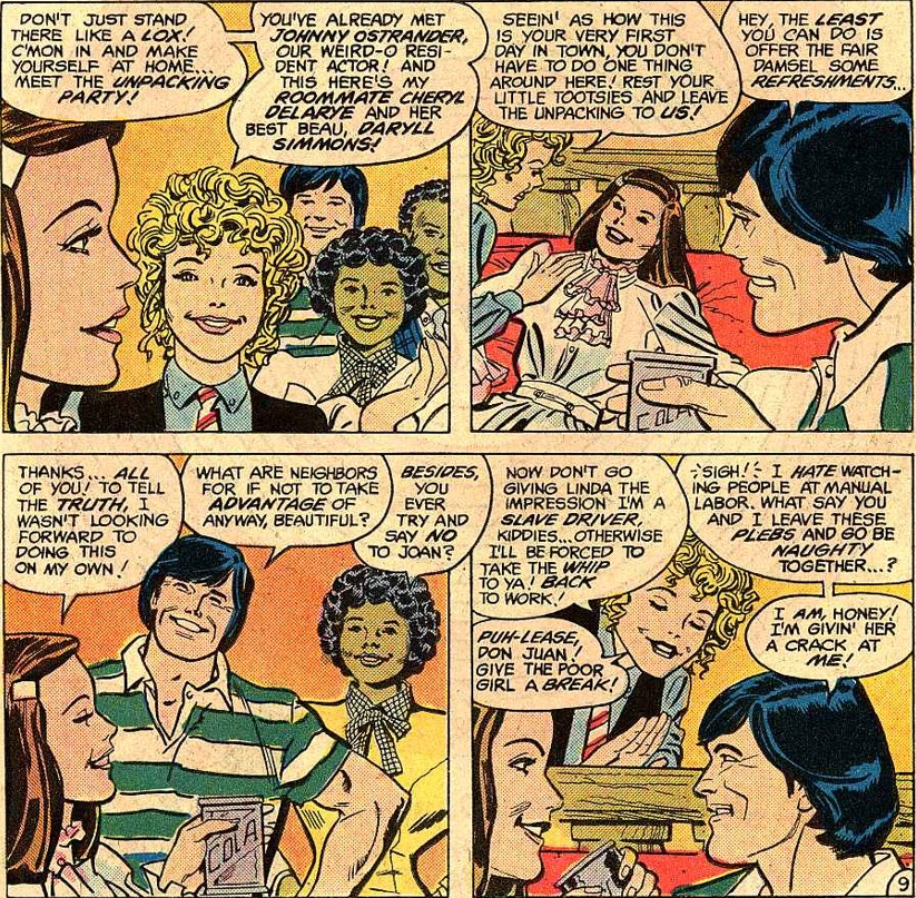
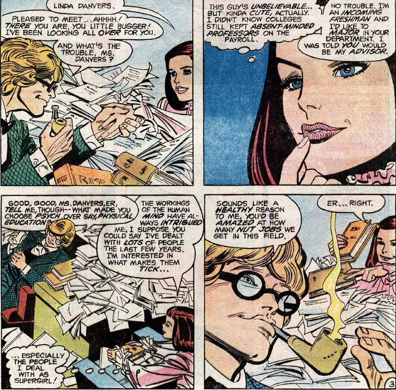
She enrolls into university, gaining a supporting character and an apartment…
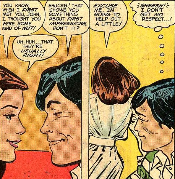
…and a neighbor in John Ostrander. Yes, the comic book writer… kind of.
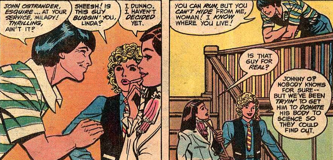
You see, John Ostrander was a friend of Paul Kupperberg and at the time this comic was published he wasn’t a writer yet.
He will go on to become a prolific and important writer for DC Comics, most importantly for his work on basically inventing the Suicide Squad (I’m also a huge fan of his Spectre run).
If you’ve seen the James Gunn’s Suicide Squad, he has a cameo as the scientist injecting Savant at the very beginning.
And he’s going to be a supporting character hitting on Supergirl for a good chunk of the series!!!
Comic books are weird, man.
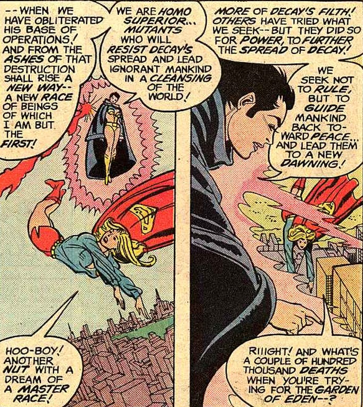
The Supergirl plot kicks off when she runs into another student who is secretly a mutant (???) with untapped psychic powers, and who is manipulated by the creepy Mr. Pendergast…
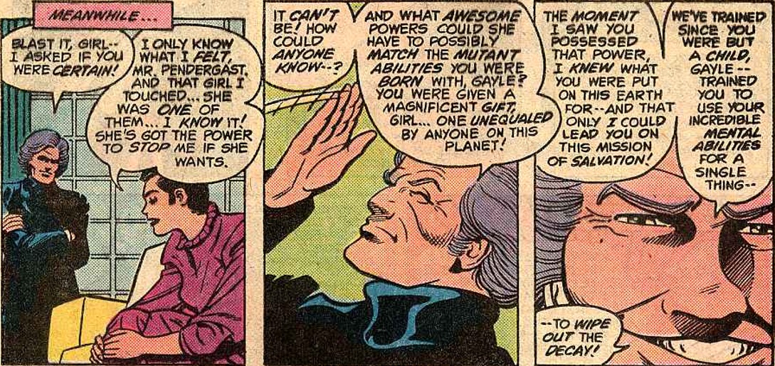
…to become the supervillain Psi, complete with a costume that she needs for serious reasons and not for cheap fanservice.
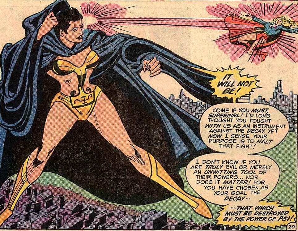
She’s a real powerhouse… but like I said, the artwork makes no favors to this series.
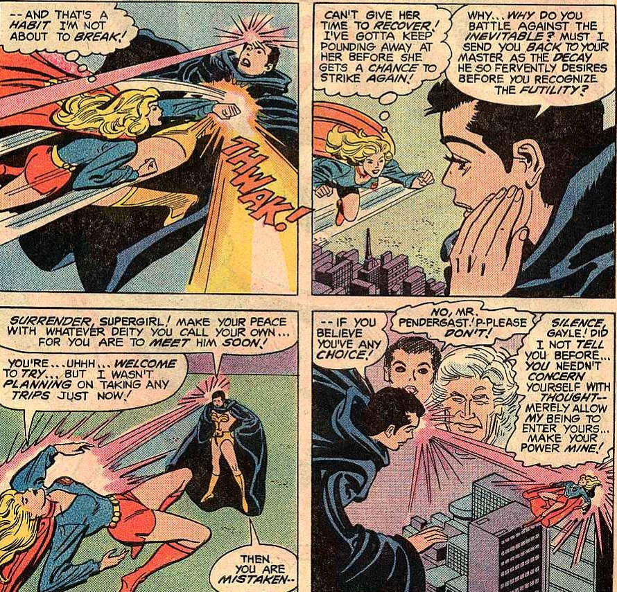
Supergirl actually loses the first round, leading to a cliffhanger.
Supergirl v2 #1 (1982)
by Paul Kupperberg & Carmine Infantino
cover by Rich Buckler
From the second issue Lois Lane is the backup story. I don’t know if there’ll be Lois stories worth covering, but I’m very happy to say there is no Jimmy Olsen serial.
More bad Infantino. This is so unrecognizable from his best work it’s almost unfair to criticize.
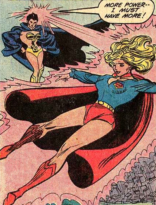
You might have noticed (if you’re able to stand the art) that Psi is constantly going on and on about “decay”, so maybe SHE is noticing the artwork?
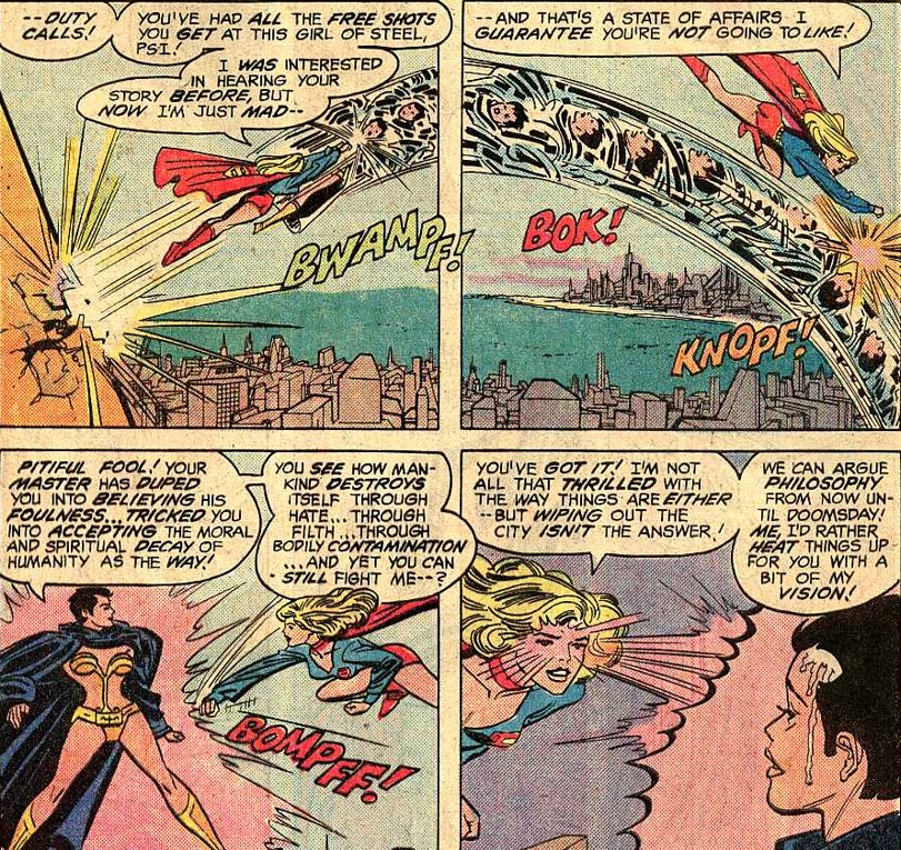
It might be a distraction from the fact that she’s 100% stealing Magneto’s shtick. I mean come on, she’s EXPLICITLY calling herself a “Homo Superior mutant”!!! How more blatant can you get!?
I appreciate the effort to give Supergirl her civilian supporting cast: one of the things that hurt her previous runs was a lack of interesting civilian stuff. Too bad these guys all seem extremely bland to me, and I can’t stop thinking Ostrander is creepy.
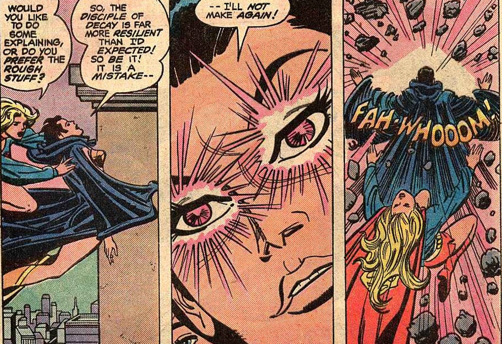
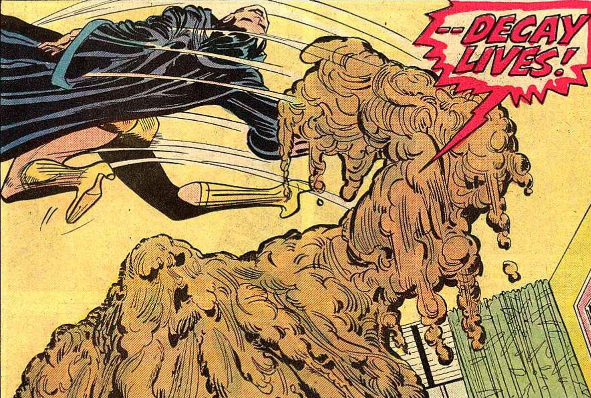
We end the story with Psi, after her defeat at the hands of Supergirl, transforming Mr. Pendergast into a Clayface ripoff.
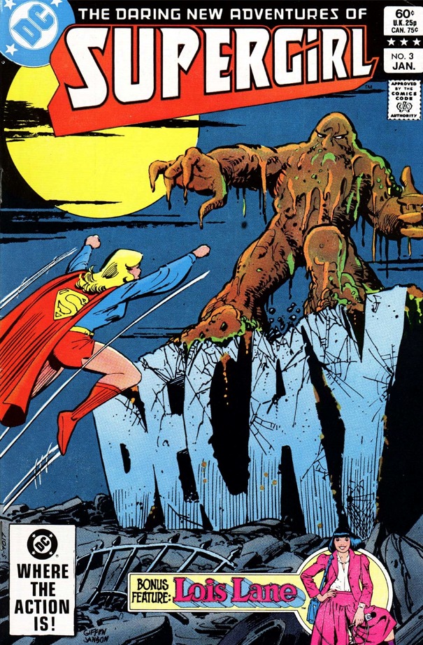
Supergirl v2 #3 (1983)
by Paul Kupperberg & Carmine Infantino
cover by Keith Giffen
Scratch that, Clayface is interesting.
Decay just melts people. Which is supposed to look horrifying, but… have I complained enough about the artwork?
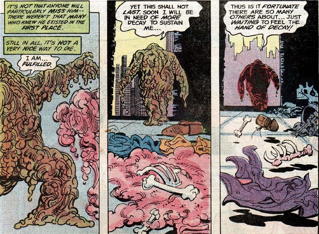
After pages of fight that go nowhere, Psi ends up reverting Decay into his human form.
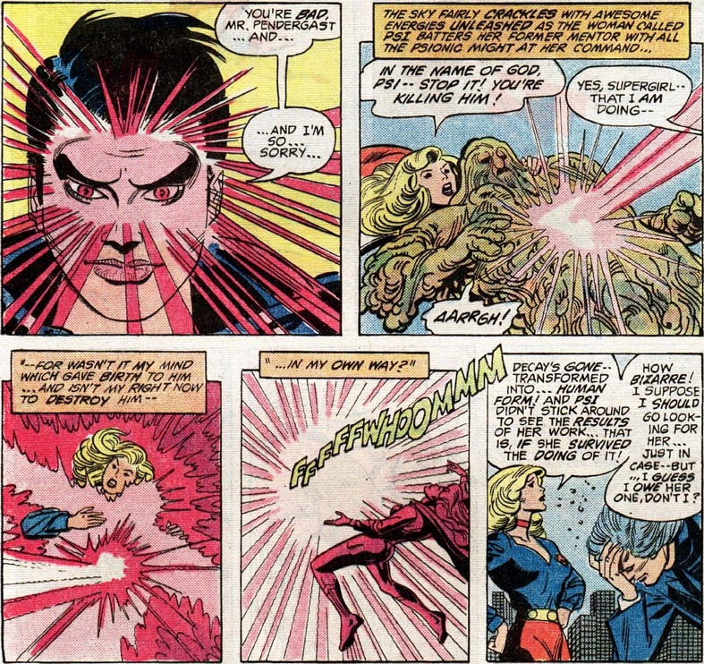
This is the last appearance of Decay. Psi also disappears from the series, returning years later only to be killed off. So wasting 3 issues on these two wasn’t a great idea in retrospect.
The last part of Supergirl’s new status quo is that she’ll be studying psychology under an absent-minded professor. Who will later become a super-geneticist, because comics.
If it looks like I’m rushing through this series… yeah, I’m just trying to get this done because I really don’t enjoy this one.
Historical significance: 3/10
The last in a long history of status quo changes.
Silver Age-ness: 0/10
Nothing stands out.
Does it stand the test of time? 4/10
A lot of your enjoyment is going to depend on how much you like the artwork. And by a lot, I mean it’s entirely going to depend on it.
Taste being subjective and all… this is one of the ugliest series I’ve seen from DC’s early 80s. If you do like the artwork, this could be a 6/10.
The writing is serviceable but nothing spectacular. Despite the amount of time spent on them, both Psi and Decay are very boring (especially the latter). And while I do respect the attempt to flesh out the civilians, it’s all very very rushed and way too convenient.
Supergirl deciding to study psychology also seems… odd. They never had a clear idea of WHAT exactly she studied when she went to college, but her previous jobs are either in the filming industry or student counseling… nothing about her history makes me think she cares about psychology!
There’s really no other artist i can think of besides Infantino that has such a stunning gap between his best and worst work. His 60’s Flash is truly definitive. This (and some late Marvel issues that i can recall) is truly unfortunate.
For Silver Age artists nobody comes to mind, but for later years I immediately think Frank Miller.
And in case I didn’t make it clear, of course I think 60s Infantino is great.
Infantino was a great artist with an enormous legacy… but on THIS series, I’m sorry but the artwork is just plain ugly to me.
Even at the height of his Silver-Age popularity, Infantino’s pencils relied on his inkers to give his art that grace and swoop. I’m not taking away from the man’s skill at the time. But he was always prone to sharp angles and broad diagonal positioning. People, animals, buildings, cars, whatever, had a lot of unnatural points before an inker like Murphy Anderson or Joe Giella or Sid Greene smoothed away the extreme edges and positions. Murphy Anderson once remarked how tough it was to “rein in” Infantino’s pencils on the Adam Strange series in Mystery in Space (which is why editor Julius Schwartz assigned him the task in the first place). But, somehow, the effort brought out the best in both artists’ talents.
For an idea of how important the inker was to the grace of Infantino’s pencils, just examine his work on the first year or so on the Elongated Man back-ups in Detective Comics when Infantino inked his own pencils. The resulting art is all scratchy and jagged.
But, as Elkal accurately described above, Infantino’s work in the 1980’s had declined noticeably. Unsteady line work; thick, blocky figures; impossible perspectives. It’s especially obvious, and disappointing, in his 80’s work on the title where he made his bones: The FlashI.
Just as in the case of popular singers, some can keep it together into their golden years, while others should quit while they’re still admired.
Alas, Infantino fell into the latter camp.