
Tales of Suspense #39 (1963)
plot by Stan Lee
script by Larry Lieber
pencils by Don Heck
cover by Jack Kirby & Don Heck
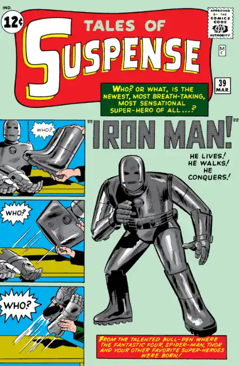
From the cover, it would be safe for a reader to assume this is another monster comic.
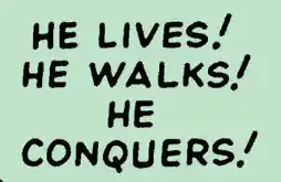
I mean, that is a weird tagline for a hero.
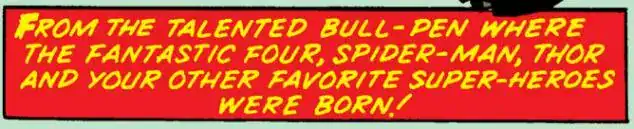
It’s also notable that Marvel is promoting new characters by reminding readers of their previous successes. You would NEVER find a caption like this in a DC comic in 1963.
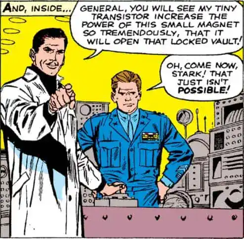
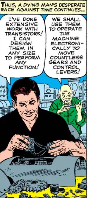
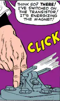
We begin with Tony Stark using transistors to create whatever effect the plot demands.
Transistors might as well be magic as early Iron Man stories are concerned.
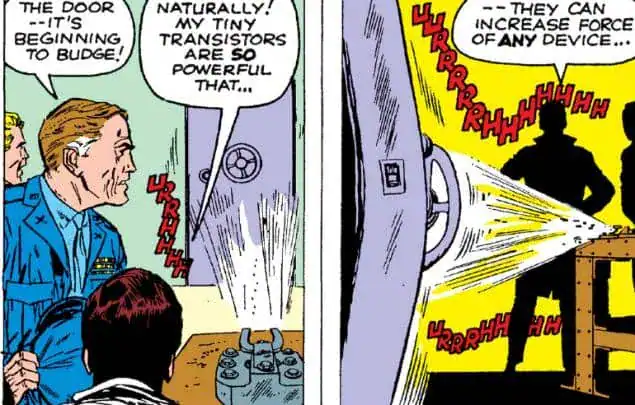
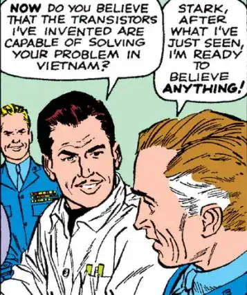
Future retellings will change the exact location of where Iron Man’s origin takes place: it starts off explicitly in Vietnam, but it will then be retconned into China, then to the fictional country of “Sing-Cong” (!!!), then to Afghanistan, and I believe today Marvel’s official position is ¯\_(ツ)_/¯
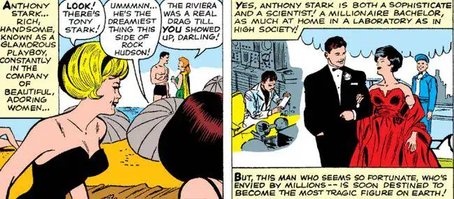
The story doesn’t dedicate much time to establishing who Tony is. Literally two panels, in fact.
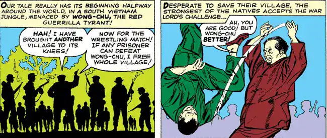
Which isn’t a Vietnamese name in the slightest, but to be fair the story doesn’t say that HE is Vietnamese.
Also, as it was typical of the time, every single Asian person is literally yellow-skinned.
Easily the least believable part of the origin story is the idea that a billionaire would walk into a warzone in person to check his equipment.
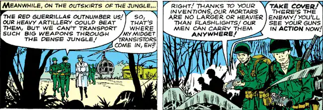
What could possibly go wrong with that?
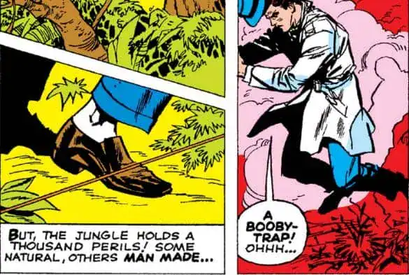
If you have seen the movie, its adaptation of this part of the origin was pretty spot-on despite completely omitting Wong-Chu.
Which I think we can all agree was a good call.
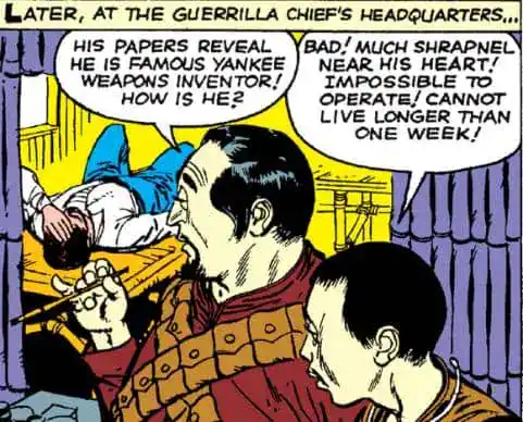
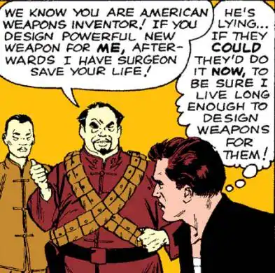
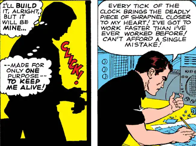
In the comics version, however, Tony doesn’t really need much convincing before immediately starting to create the means of his escape.
Also, the idea that he’s being kept alive by an electromagnet keeping the shrapnel in his place is a later clarification; it’s more vague here.
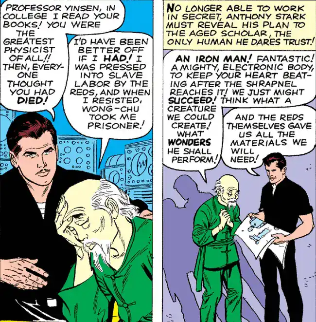
Considering the time, the comic’s treatment of Professor Yinsen is refreshingly respectful.
Don Heck is no Jack Kirby, but I think he’s doing a pretty good job at drawing technology.
Even if Stan Lee clearly has no idea what a transistor is.
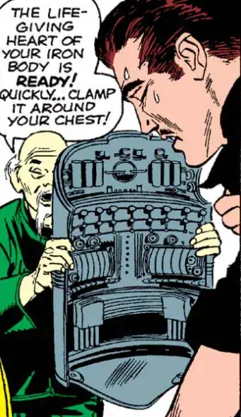
Something else ketp in the movie is Yinsen sacrificing his life to distract the enemy while the Iron Man armor is charging up.
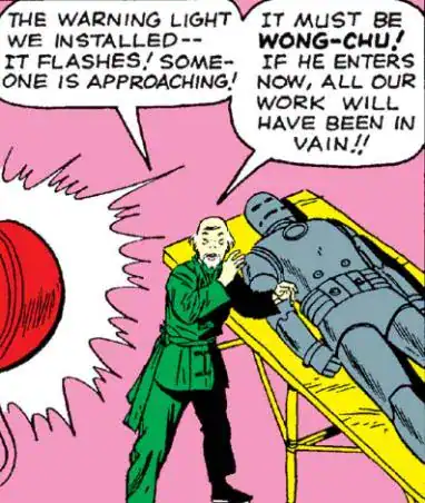
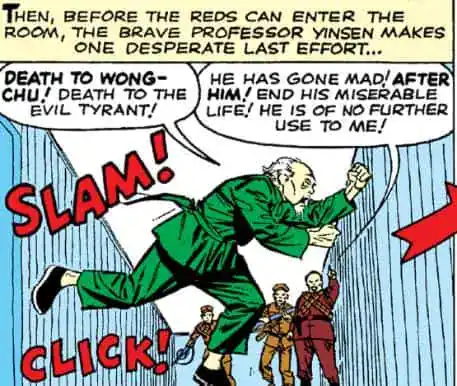
The cover promised that you could walk, Iron Man.
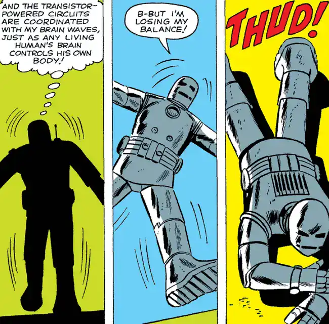
Jokes aside, this is a neat touch of realism. I can’t imagine this thing being easy to operate, when you consider that the first model has no computer system to help.
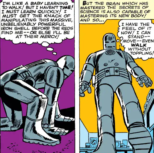
I also like how Tony has a bit of an existential crisis before going into this first battle.
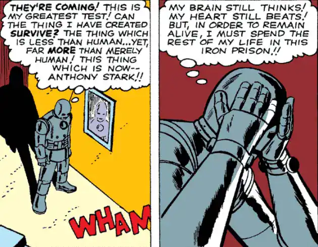
 Iron Man, Iron Man, does whatever a Spider-Man can
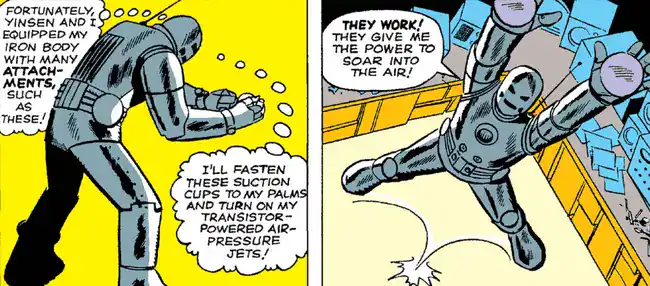
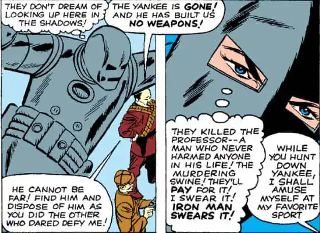
One of the most fundamental laws of any fictional universe is that wearing a trenchcoat and a hat will disguise ANYONE.
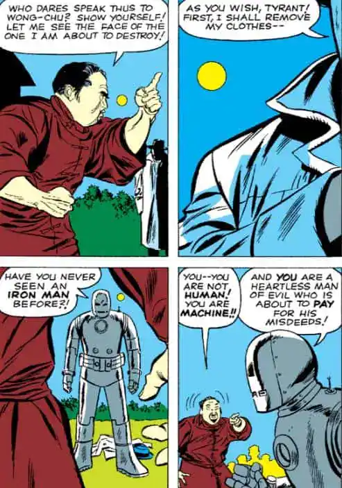
Yeah I can see why Wong-Chu didn’t make the cut in Iron Man’s rogues gallery.
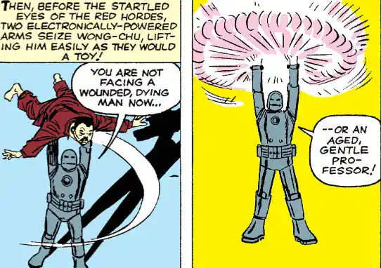
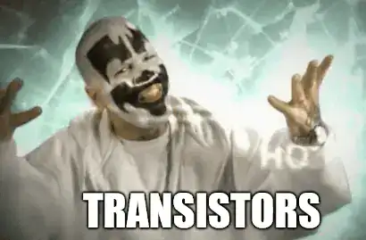
If you’re wondering why Tony Stark eventually has trouble with alcoholism, he played the wrong drinking game: taking a shot whenever Iron Man mentions transistors or magnetism.
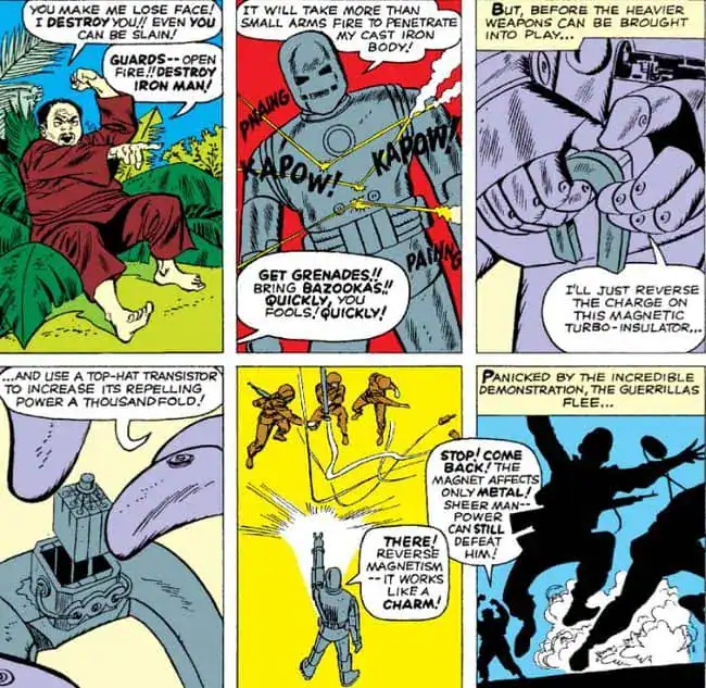
I might have dismissed Wong-Chu too soon.
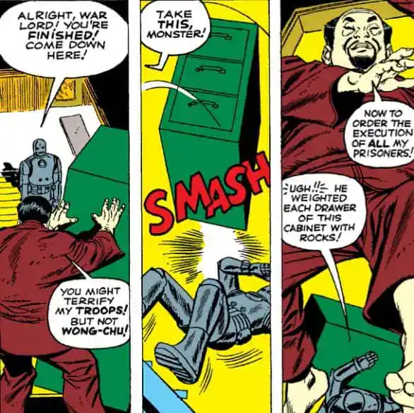
An Iron Man gadget that is NOT based on transistors? In THIS comic???
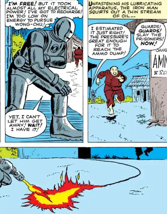
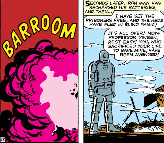
And so the comic ends with Iron Man avenging the death of Yinsen.
Bonus: this is still an anthology book, so there are other stories.
One is a Stan Lee & Gene Colan story about the sun dying and people evacuating the planet… except one couple.
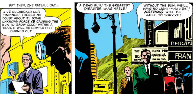
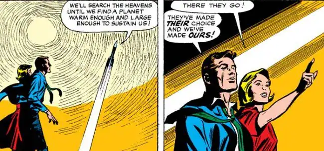
Who survive because the planet is now orbiting a brand new star.
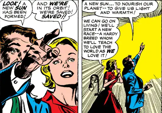
Excellent pencils. Terrible story.
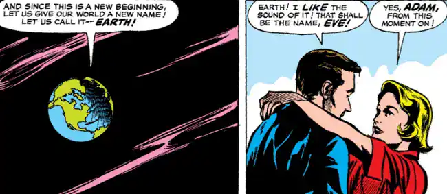
I’ve already reviewed the other story in the book.
Historical significance: 10/10
Obviously important for Iron Man, who in return is a pillar of the Marvel Universe.
Silver Age-ness: 3/10
The transistors might as well be magic.
Does it stand the test of time? 7/10
As far as Silver Age origins go, it’s pretty straightforward and not as racist as you might fear.
When compared to its retellings, it doesn’t hit as hard because we really don’t know much about Tony Stark. He does, however, show a level of vulnerability you might not have expected.
How close is this to the modern character? 5/10
I obviously can’t cover the ENTIRE history of Iron Man, but there’s a couple of tidbits worth mentioning.
While Stark’s status of a billionaire playboy inventor was definitely inspired by Howard Hughes, Don Heck based Tony’s physical appearance off Errol Flynn.
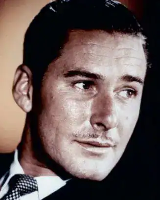
According to Stan Lee, he created the character in direct contrast to the sentiments of his typical readers. This quote comes from decades later though, so take it with a grain of salt.
I think I gave myself a dare. It was the height of the Cold War. The readers, the young readers, if there was one thing they hated, it was war, it was the military. So I got a hero who represented that to the hundredth degree. He was a weapons manufacturer, he was providing weapons for the Army, he was rich, he was an industrialist. I thought it would be fun to take the kind of character that nobody would like, none of our readers would like, and shove him down their throats and make them like him.
STAN LEE
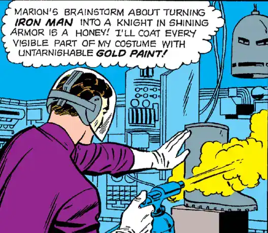
Just like the Hulk, Iron Man also stopped being grey due to technical limitations of coloring the character, in his second appearance.
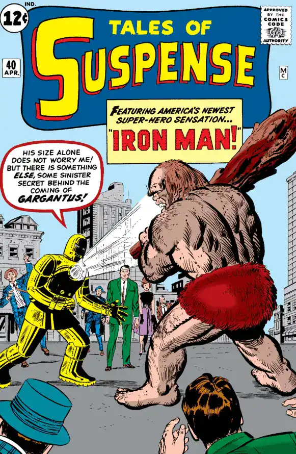
Unlike the Hulk, however, Iron Man DOES address the change in the story.
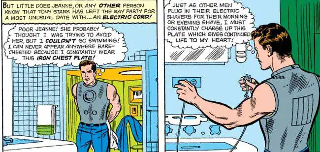
The second issue adds several details that will become important, including Tony’s biggest personal problem: his life is dependent on his chest plate keeping his heart running.
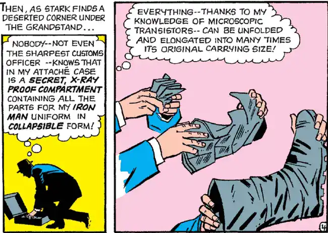
And also a questionable method of suiting up.
Jack Kirby was too busy to be the regular penciler. The spot was taken mostly by Don Heck, but Steve Ditko is also an important part of Iron Man’s history; he’s the one to introduce the classic red&gold color scheme in Tales of Suspense #48.
Iron Man would stay in the book until 1967, after which a new Iron Man series was launched.
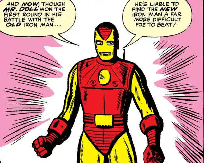
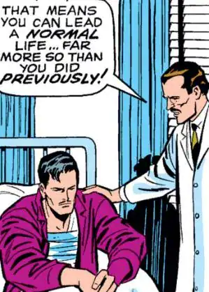
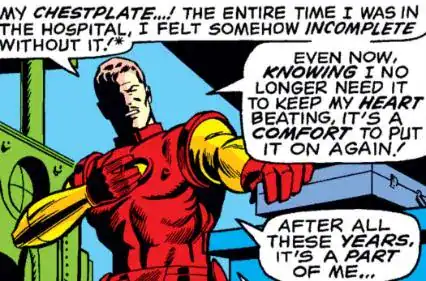
Tony’s heart problems would be solved in 1969 (during the Archie Goodwin run).
That’s far from the last time he will have health problems, most of which will be his own fault.
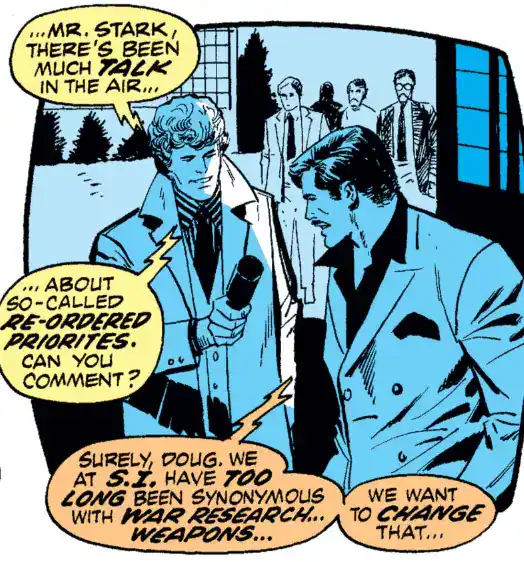
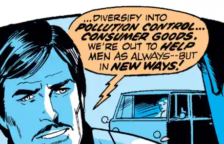
Tony Stark would be a weapons manufacturer until 1972, in the Mike Friedrich run.
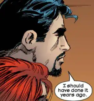
Tony Stark revealed his secret identity VERY late in his career: that’s from 2002, on Iron Man vol3 #55. Incredibly it’s not treated as a bigger deal: it’s not even the cover story!!!
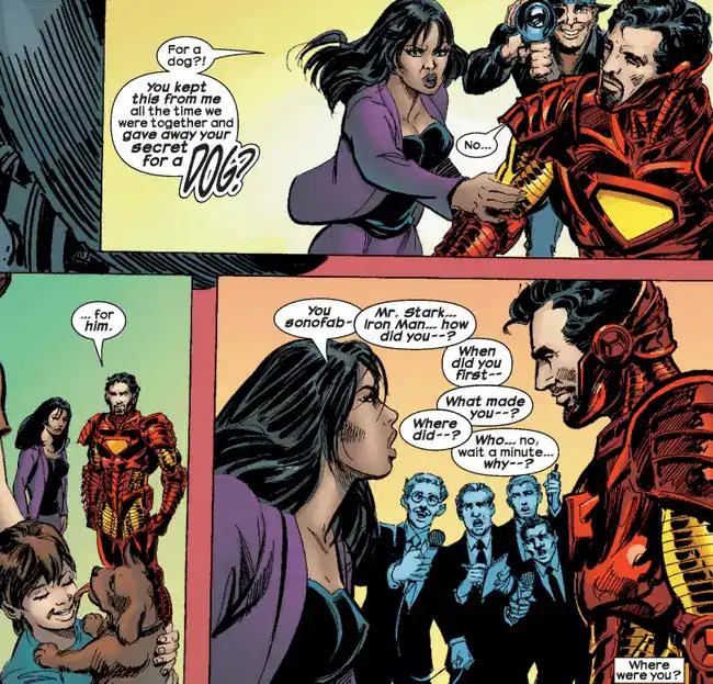
I’m ambivalent on the identity being public.
On the plus side, it IS unique to Iron Man in that it allows him to explore the aspect of a superhero being a celebrity. He’s far from the ONLY one, even at Marvel, but most other superhero celebrities become superheroes first and celebrities later… for Stark it’s the other way around.
On the other side, I always liked how the secret identity allowed Tony to see how regular people acted around him and had a better understanding of his public image.
Overall I think it was a good move as we gained more than we lost, but still.
When compared to other superhero mentors, Yinsen was basically a footnote for decades.
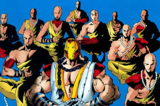
In 2000 the Quesada run brought us the “Sons of Yinsen”, a cult of monks that worshipped him.
That’s exactly as dumb as you think a Quesada run could be.
In 2017, the Al Ewing series “U.S.Avengers” introduced Yinsen’s daughter, which I’m guessing Tony didn’t know since she was living elsewhere with her divorced mother.
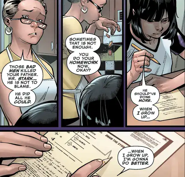
That’s Toni Ho (the full name of her father was Ho Yinsen), and she’s become a superhero on her own over the years.
She’s awesome: basically she’s what Bendis TRIED to do with Riri Williams but couldn’t pull off because he’s nowhere near as good a writer as Al Ewing.
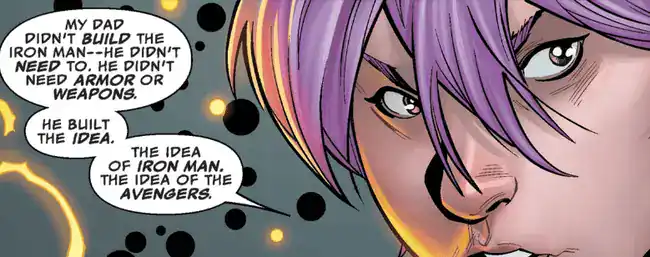
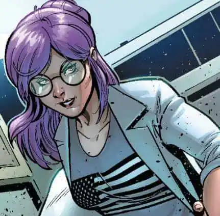
And finally, since Iron Man is one of my favorite superheroes… I have opinions on several major and minor aspects.
FAVORITE LESSER-KNOWN STARK EMPLOYEE
In recent years it looks like the only people working for Stark are Pepper, Rhodey and sometimes Happy. But Iron Man used to have a sizeable supporting cast of regular and not-so-regular people.
#3: Friday
She starts of as Tony’s A.I. assistant, but in the Slott run she acquires a robot body and develops into her own person. 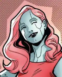
#2: Erica Sondheim
Considering how often Stark has medical trouble, it’s no wonder that he has a personal physician in his supporting cast. What IS surprising is that he never once tried to sleep with her, mostly because of her no-nonsense attitude towards his craziness.
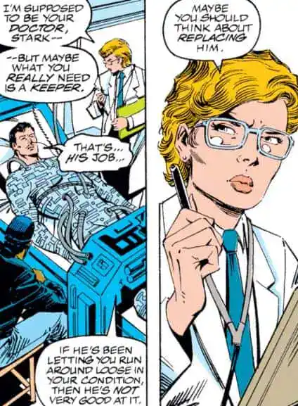
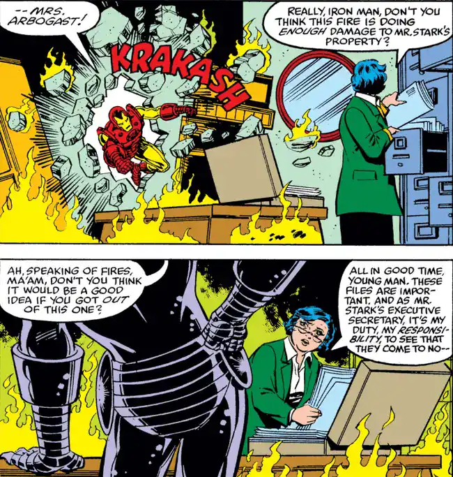
#1: Mrs. Arbogast
Best. Secretary. EVER.
FAVORITE LOVE INTEREST
Likely unpopular opinion: Pepper Potts is overrated.
Yes she was Tony’s first serious love interest, but she disappeared in the 70s and did not return to a prominent role until the late 90s. And honestly, besides her relationship with Tony I don’t find her all that interesting!
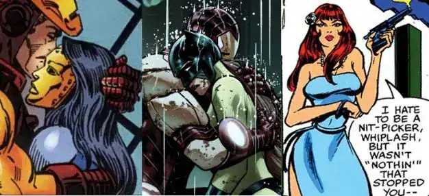
Give me the doomed romance with Madame Masque, the toxic co-dependency with Hellcat or the tough-as-nails bodyguard Bethany any day.
#3: Madame Masque
#2: Hellcat
#1: Bethany Cabe
FAVORITE NEMESIS
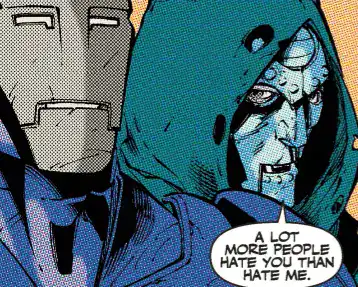
#3: Doctor Doom
The Mandarin doesn’t ENTIRELY work as an Iron Man villain, and while they do have enough history together… Doom fulfills his role MUCH better, especially after Iron Man has become more central to the Marvel Universe. Just don’t tell Doom he’s not #1.
#2: Justin Hammer
That being said, the best Iron Man villains are actually Tony Stark villains. And nobody plays the evil billionaire best than Hammer.
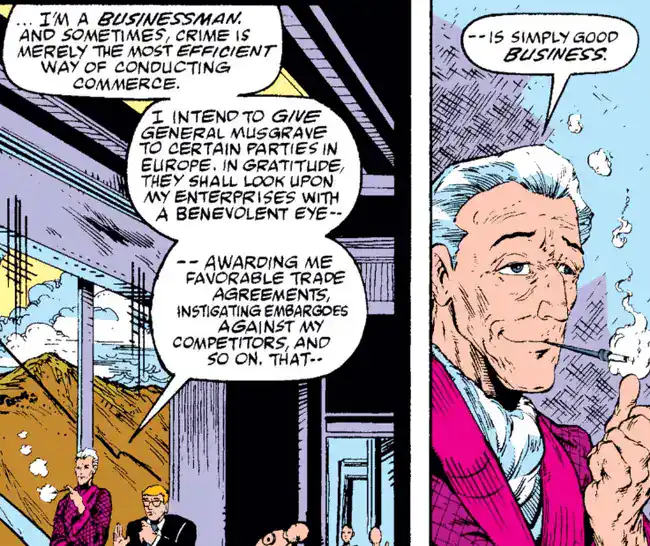
#1: Obadiah Stane
At least Hammer has SOME standards. Obadiah is just absolutely rotten to the core.
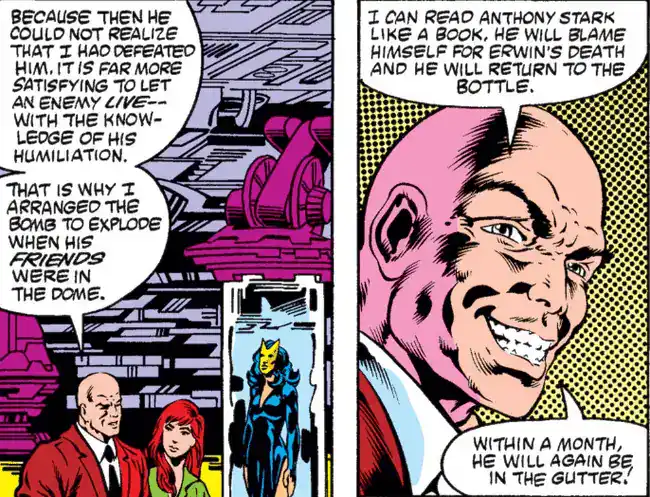
FAVORITE ARMOR
I once ranked my favorite Doctor Doom armors. I considered doing the same for Iron Man… but it would honestly require a whole retrospective of its own given how many there are!
Seriously, the closest thing to an official list includes 76 main ones. Excluding variations.
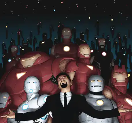
These are just those I would rank the highest based on esthetics and history alone, considering that the actual capabilities of each armor tend to fluctuate.
#10: Mark 50 (2014) – “Endo-Sym Armor”
It’s rare for an armor to break the red & gold scheme successfully, but this one pulls it off. Not a ton of history, being around for just one major storyline, but it’s a memorable one.
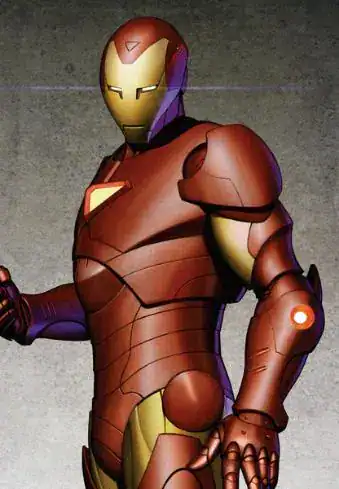
#9: Mark 13 (2005) – “Extremis Armor”
Reportedly a major influence over the armor’s look in the movie. A bit too bulky to get any higher, and I’m not a fan of the triangular Uni-Beam™ on the chest.
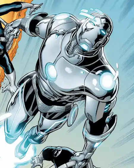
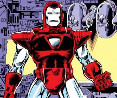
#8: Mark 7 (1985) – “Silver Centurion”
There are two styles of Iron Man armors: the sleek ones, and those where he’s a walking tank.
I tend to prefer the former, and I reeeeally don’t like the unique way this one flies, but it first shows up in what is possibly Iron Man’s best arc ever and it sticks around. Plus, easily one of the most recognizable of the bunch.
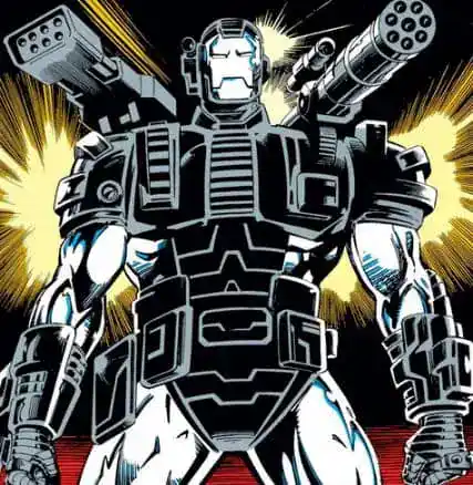
#7: Mark 11 (1992) – “War Machine”
The best of the tank concept. Rhodey will make this his armor, but Tony wore it first so it still counts. It’s admittedly dumb to stick so many weapons on top of the armor, but it still looks badass AND it debuts in what is probably my favorite run overall.
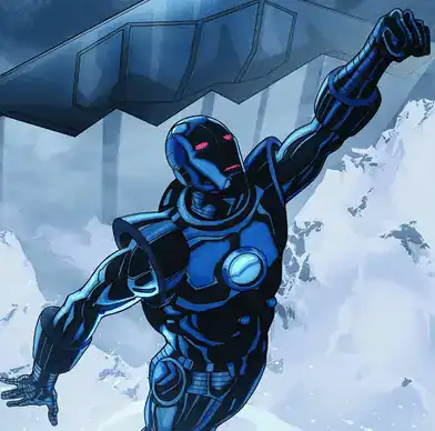
#6: Mark 6 (1981) – “Stealth Armor”
The best-looking specialized armor. ‘Nuff Said.
#5: Mark 4 (1976)
This is THE classic Iron Man armor. Tons of variations; for the longest time only the interior changed with the looks remaining the same until the Silver Centurion version.
It’s nearly flawless… which is part of my problem with it: the arms and legs look too much like a costume and not enough like an armor.
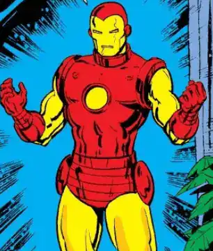
#4: Mark 9 (1988)
Not a huge variation over the classic; in fact it’s a return to form, since this one replaced the Silver Centurion. I always thought that the bulkier boots and gloves were a visual improvement withouth sacrificing too much the sleekness of the classic.
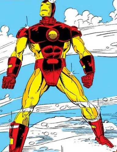
#3: Mark 13 (1993) – “Modular Armor”
I’m not even a huge fan of the metallic midriff or the pentagram Uni-Beam™, but in my opinion it has THE best faceplate: I prefer when the mouth is not shown.
Plus it’s once again from my favorite run and the concept was neat: instead of stuffing every gadget imaginable into the same multi-purpose armor, this one was a stripped-down version which allowed attachments for specific missions.
This is also why the Hulk-Buster Armor is not on the list: technically speaking it’s an additional attachment worn ON TOP of this one!
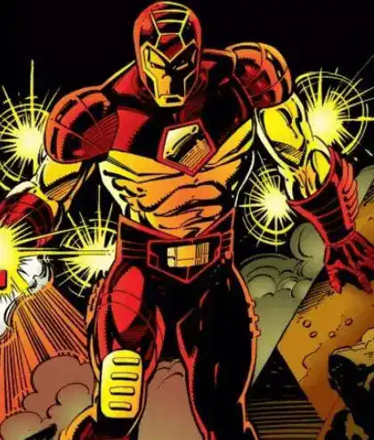
#2: Mark 16 (1997)
This is the sum of a lot of previous armors: it has the classic design, the older pointed mask from the Mark 3, the huge gauntlets from the Mark 9, and lots of tiny details that make this one feel like an actual piece of advanced technology.
Back to the “single armor that does everything” design, pulling it off without making it too bulky.
Not a huge fan of the Uni-Beam™ design though.
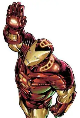
#1: Mark 70 (2020)
Once again, the concept is to go back to a slimmed-down version. But in my opinion this design allows for the best of every iteration: it’s somehow sleek and bulky at the same time, and unlike other similar attempts it doesn’t butcher the Uni-Beam™.
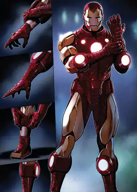
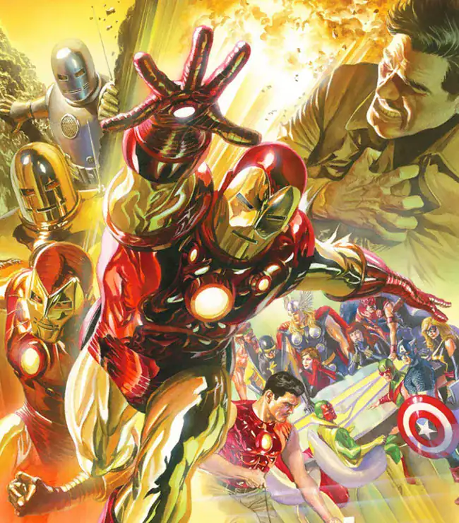
Probably not a coincidence that the top two armors were BOTH designed by Alex Ross.
Obadiah Stane was a great villain partly because Denny O’Neil gave him plenty of time and space to develop as an adversary and to show his personality. And it’s a great concept for an adversary – A player of games who will settle for nothing less than total victory over his opponent, and who is willing to stoop to any means to gain the victory. There was no satisfaction in earning the victory, only in getting it for Stane. Case in point: as a child, he murdered his opponent’s pet so his superior opponent couldn’t win in a chess tournament. And victory for Stane had to be total: it wasn’t enough for him to take everything Stark owned and make him relapse into alcoholism – for the victory to be total, Stark had to be dead, preferably by his own hand. And when Stane finally lost, he ended his own life, ceding Stark the victory.
Mark 16 is the Patrick Zircher Armor from Vol 3 (the Kurt Busiek run) #1, right?
I did not know that it was designed by Alex Ross.
Most recent readers probably don’t realize how big a deal it was to introduce the Silver Centurion. Mark 4 is very much a classic, and long-lasting.
I also like the Modular Armor’s helmet, as well as the basic idea.
For the armor you ranked at #8, it is my understanding that it is called the Silver Centurion, not Scarlet Centurion the way you have listed. Scarlet Centurion is just another Kang variant. And I believe it is model 8, not 7. Also I may be wrong but aren’t they called “model” in the comics and not “mark” like in the mcu?
D’oh! Either I had Kang on my mind or he’s messed with the timeline again.
The nomenclature is MOSTLY from secondary sources, as it’s very rare for the main series to officially acknowlege any numbering system… as such it’s not always consistent, and the numbers can be shuffled around depending on the source.
The closest thing to official lists do use “Model” lately, but I distinctly remember having seen “Mark” way before the movies to the point of instinctly thinking “Mark” for the armors.
If this was an official retrospective or even a dedicated Random Thought I would’ve put some research on it to clear up the confusion, but as a quick coda I hope it’s still acceptable.
Iron Man #126 pays homage to Kirby’s cover to TOS #39, in a beautiful drawing by John Romita Jr. and Bob Layton. It was the cover of the first Iron Man comic I ever bought, and it embodies the spirit of the Layton-Michelinie version of the character, which to my mind has never been surpassed.
One thing that puzzles me about the creative origin of Iron Man is where the name “Tony Stark” came from. My speculation is that it was inspired by dashing playboy actor Tony Curtis; if you take the consonants in his last name and reverse them, they spell out STRC—which readily suggests “Stark.”
This first story, taken alone, suggests a much higher level of ‘stuck in the armour’ than would be the case even by the next story (where only the chest plate clearly has to be worn and the other parts are collapsible.) Would be a quite different series if that implication had stuck.
The Adam and Eve thing was such a cliche of unsolicited submissions to SF magazines that it was already being subverted in the 40s.